Blanes Pharmacy
Blanes Pharmacy
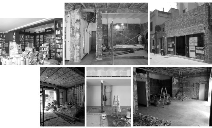
We took on the challenge of renovating the old town pharmacy on Blanes’ Passeig de Dintre. With years’ worth of clutter, it was hard to tell what was worth keeping and what needed replacement. One of the space’s treasures was a group of antique display cases and an old counter from the early 20th century. We also suspected that the ceramic vaults visible here and there should be a part of the new space. And, of course, we had to take full advantage of its privileged south-facing location on the promenade and the ideal illumination it provided. Still, all of this potential was hidden away in a little old pharmacy that had become cramped and obsolete, overcrowded with false ceilings, partitions and displays that were obstacles for attending to customers and interacting with the outside world.
Besides the old pharmacy, this project had the possibility of incorporating additional spaces that could both expand the interior space and extend the storefront along the promenade.
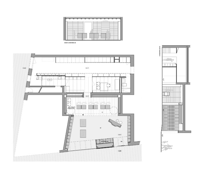
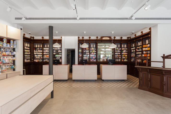
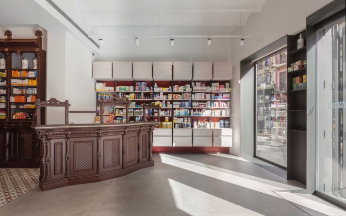
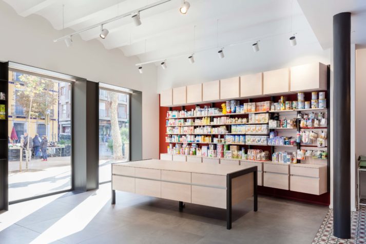
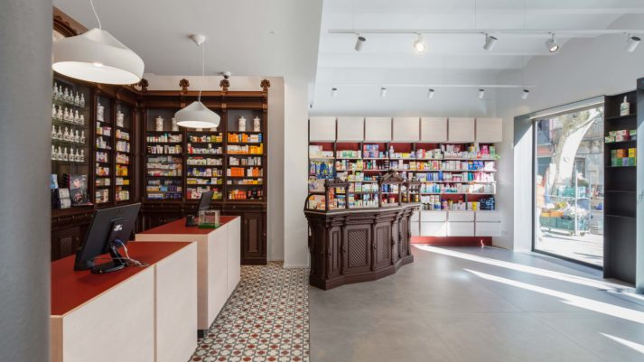
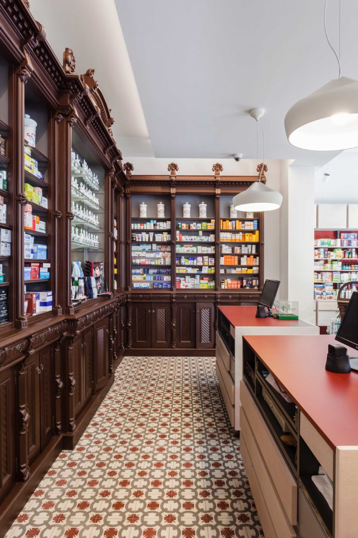
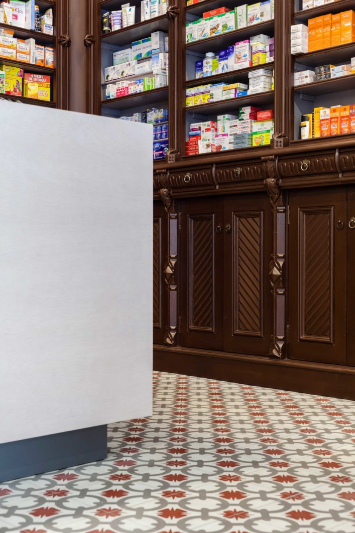
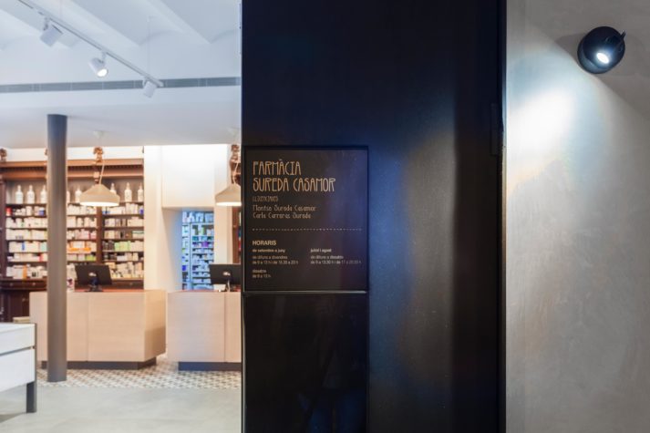
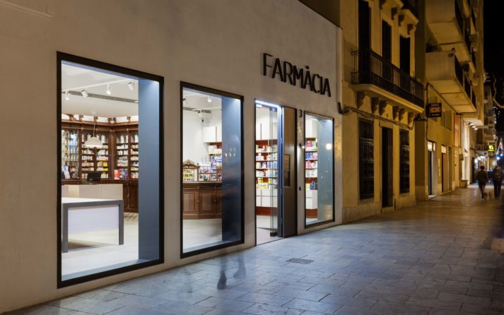
The new pharmacy is organized into three segments that are parallel to the street. From back to front, the inmost is for attending to customers. It includes three central counters that can be used to serve up to six people at once. These counters are surrounded by the restored antique display cases that give the pharmacy its character. This section is also accented by hydraulic tiles that give the space colour and reinforce its personality. Next is the clean, wide, open central area, which takes full advantage of available space by extending out towards a set of new lateral display cases. On the street side, it stretches diagonally out towards the façade, and extends upwards from a blank floor to the ceiling, which is marked by a long series of beams and ceramic vaults. This is a bright, well-qualified space where the old and the new interact, with modern counters and display cases setting off the restored antique counter.
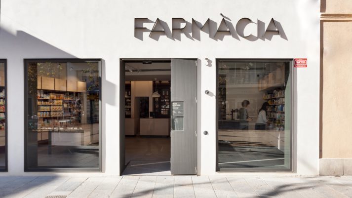
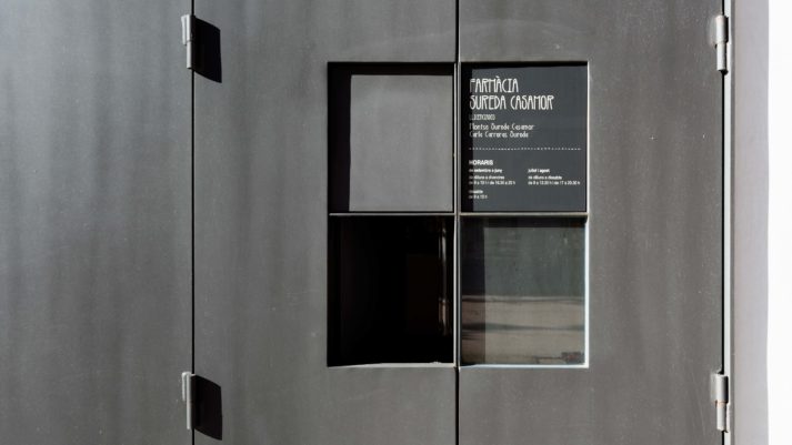
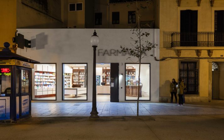
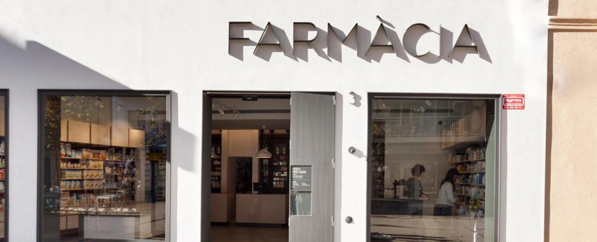
Finally, the last segment is the storefront, with four large, clean, rhythmic openings cut out of the tense slate of the façade. They facilitate the necessary interaction between inside and outside, making the pharmacy visible from the street and the public space visible from within. They are the setting for a surprising game of entrances and exits, of looking and seeing, of shifting lights and reflections both day and night.
Sureda Pharmacy, cut from iron…
In collaboration with estudi nus. Pictures by Anna Galí
Category
Renovation


