Sugrañes Flat
Sugrañes Flat
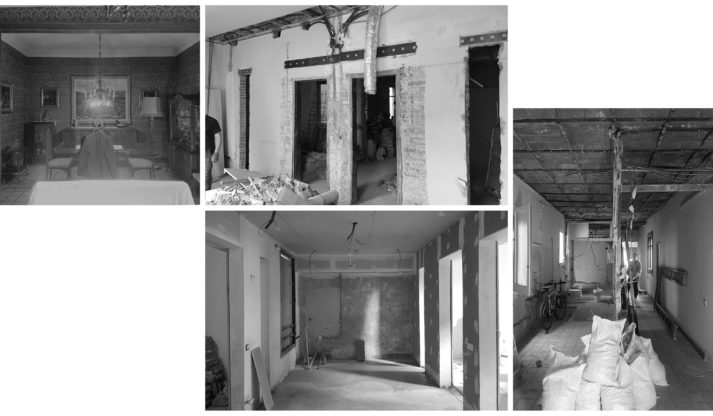
This is a flat in the Eixample neighbourhood, in a building designed by architect Domènech Sugrañes. The residence had been seriously altered by multiple renovations over the years. It was difficult to recognize its original elements besides a few doorways, a handful of areas paved with mosaic tile, the ceilings in the living room and the entryway to the dining room and, of course, the blurred inherent potential of the spaces themselves.
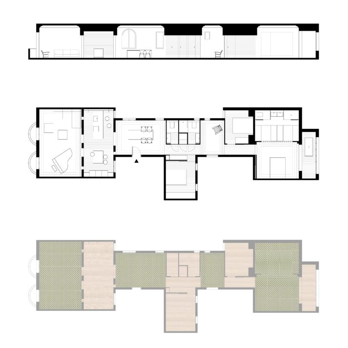
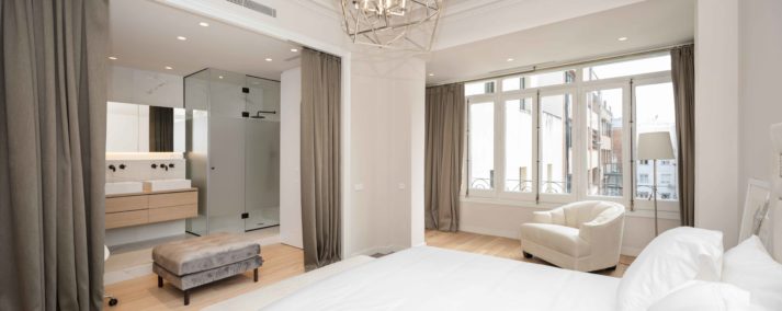
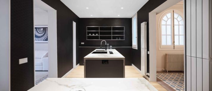
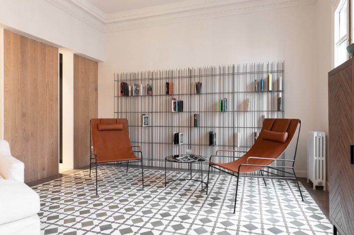
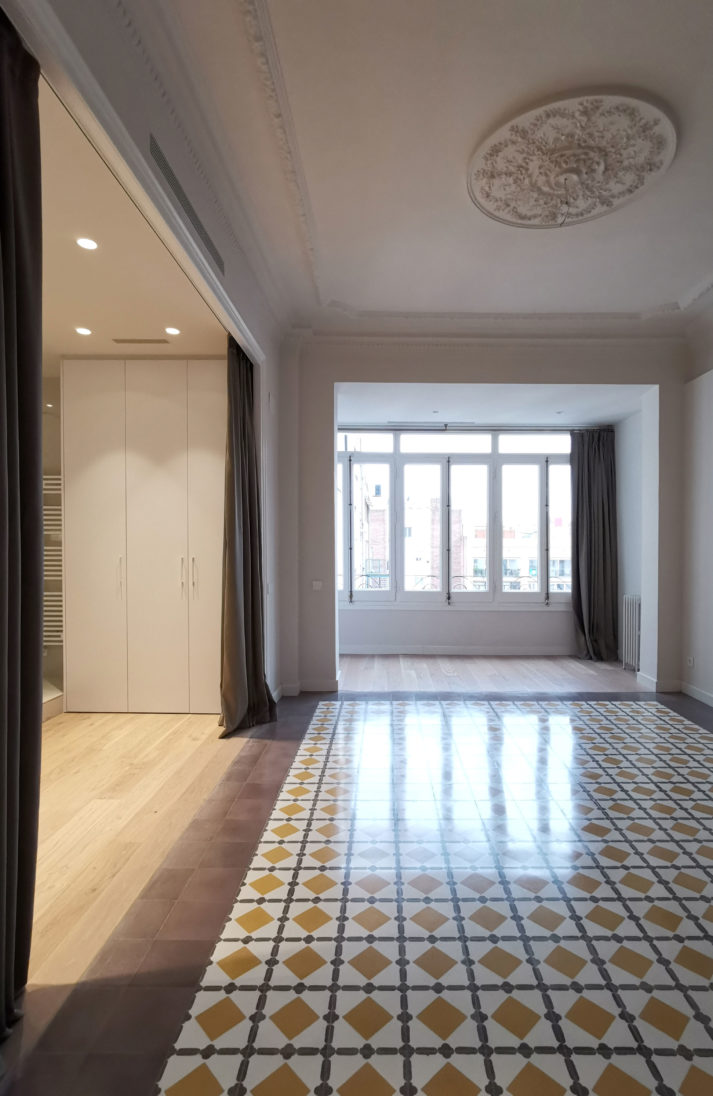
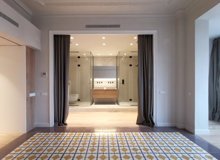
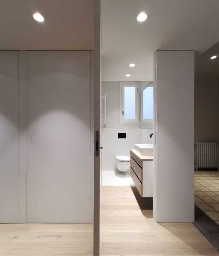
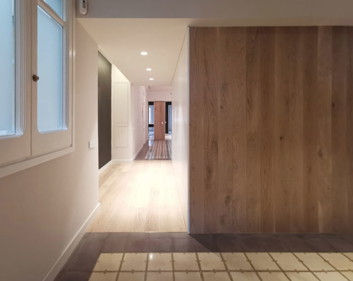
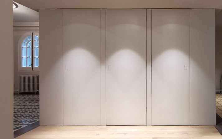
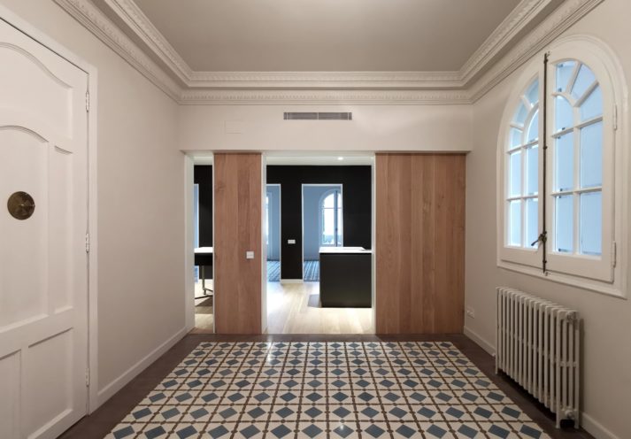
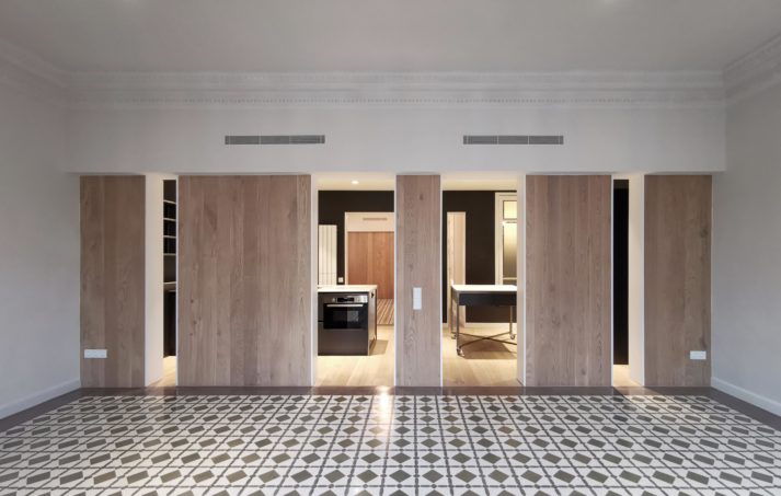
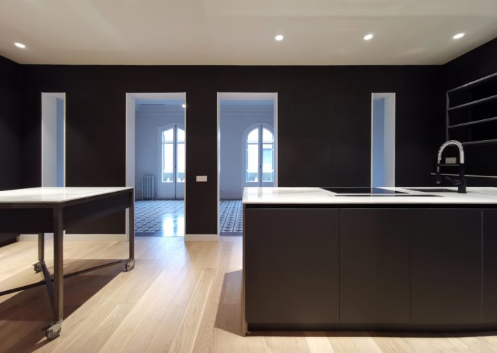
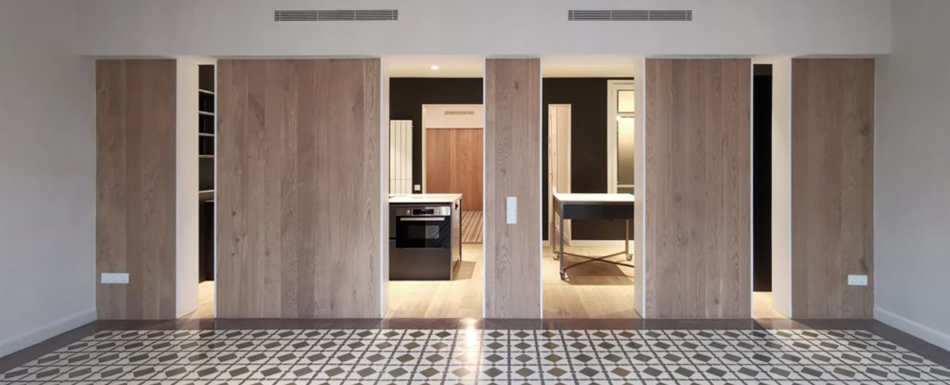
Our project sees the flat as a succession of rooms with ceilings at the maximum height framed by moulding, with floors of hydraulic tile and the inherent language of a classical residence. Between them sit a series of spaces that must be crossed to go from one room to the next and that fulfil essential functions (the kitchen, the bathrooms, entryways to bedrooms, etc.). These intermediate spaces have wooden floors, and are personalized according to their use and character. They are seen from the adjoining rooms through wooden panelling that goes from the floor up to the height of the lintel, which plays with the coloration of the large white spaces and their hydraulic tiling.
Part of the original pavement was restored. New tiling based on the original was also manufactured, with a different colour used for each of the principal rooms. The moulding in the former living room was restored, and similar moulding was added to frame the ceilings of the other rooms. The original woodwork of windows and balconies was also restored.
This project suggests a continuous, fluid space stretching from one end of the flat to the other, a new and surprising interpretation of a typical Eixample residence. Structurally, a series of transversal load-bearing walls separate the successive spaces. Although none were eliminated, the detail of the project suggested changing the thickness of the upper portions, which also house installations. Visually, they have the appearance of structural elements stretching from one extreme to the other, a sort of beam. The wooden panelling used in the lower sections of these walls gives the impression of lightness, almost as through they were mobile elements. The result is a richness of views of one room from the next, showing the widest extent of the space.
The emptiness of the pictures showing a newly-completed renovation allows us to imagine more than one way of inhabiting the space. We can picture a residence, a professional office, or the headquarters of an organization, the sort of thing the dignified flats of the Eixample have always been prepared to house.
In collaboration with estudi nus and valgreen
Category
Renovation


