Masia Torrefigueres
Masia Torrefigueres
Masia Torrefigueres is an 18th-century building of great historical value in the town of Sant Boi de Llobregat. After a long and complicated history, it’s now a municipal space. Although it’s totally integrated into the town’s urban fabric, its origins as a farmhouse can still be felt at the feet of La Muntanyeta—a hill that the town has encircled but has been wise enough to preserve as a large public park.
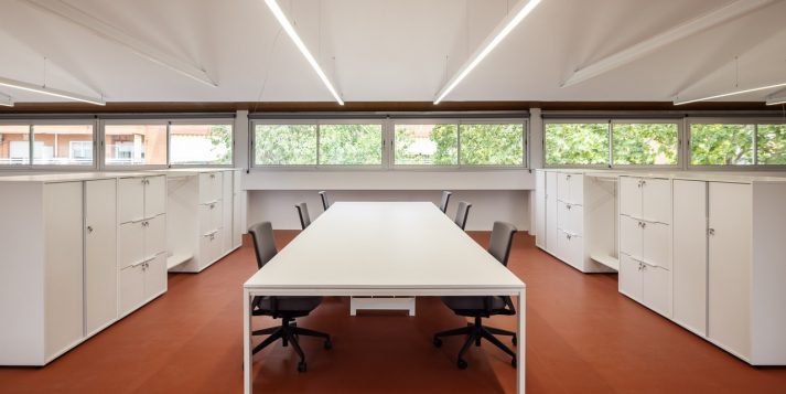
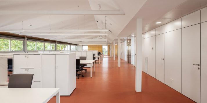
When we first encountered Masia Torrefigueres, it had served as office space ever since its last big renovation in the late 1990s. However, the administration’s lack of foresight had turned it into an obsolete building that was far too compartmentalized, disorganized and labyrinthine; it lacked installations and wasn’t up to code. It needed a bold new renovation that, in the days following the pandemic, became emblematic. The authorities decided to transfer a large portion of municipal services to a building that would be groundbreaking, with a more open, less departmentalized conception of work, ideal installations and intercommunication, and a model of self-management that would include energy efficiency and make the most of sunlight.
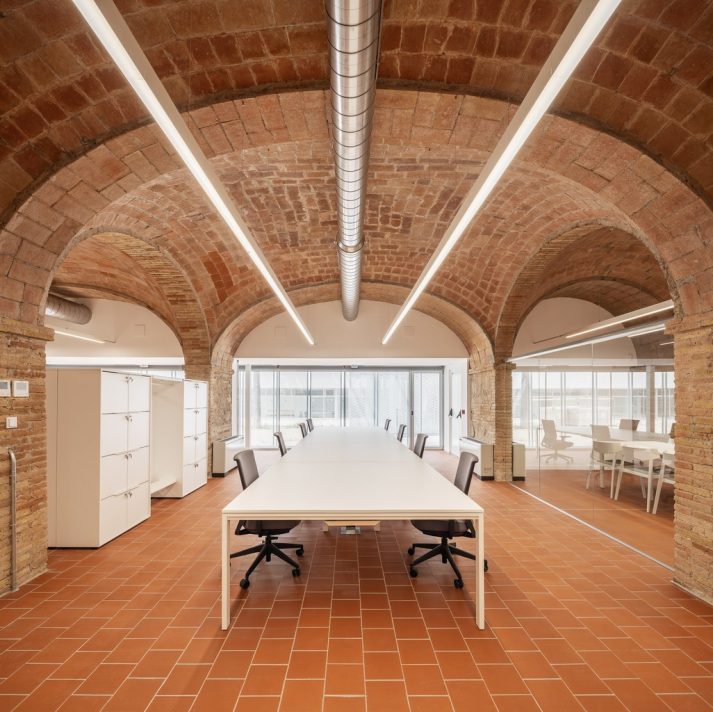
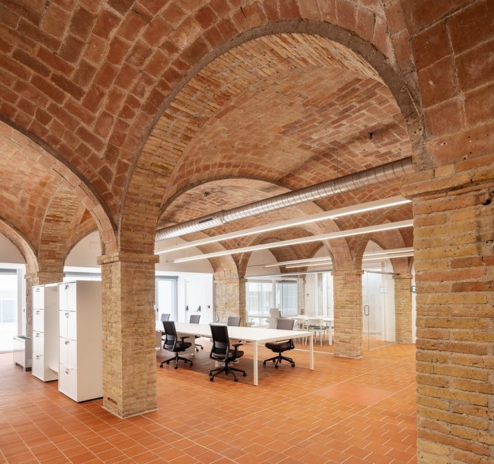
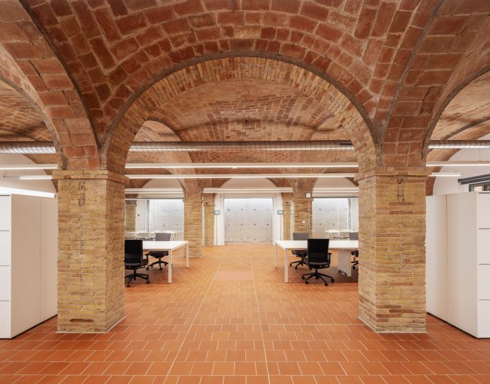
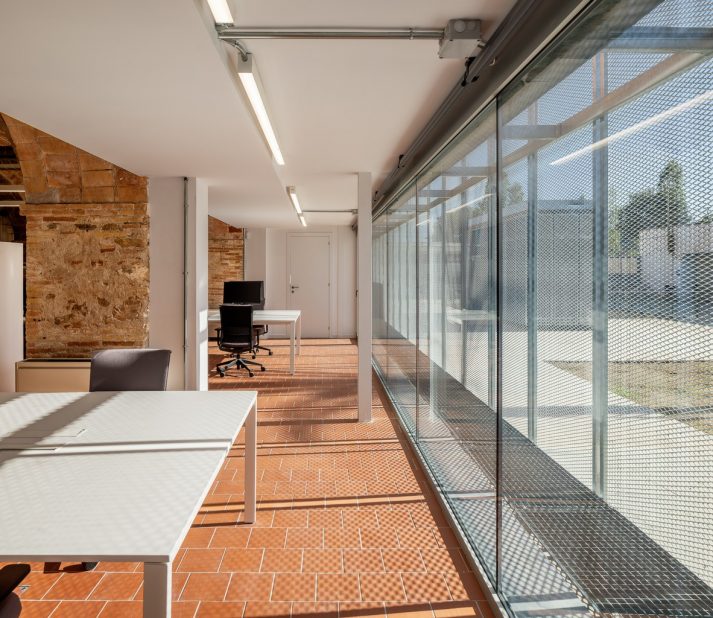
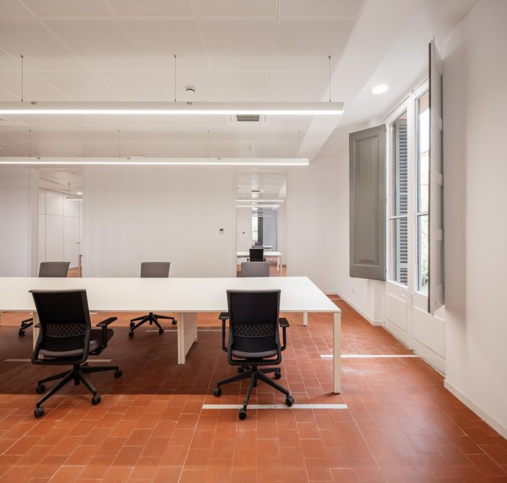
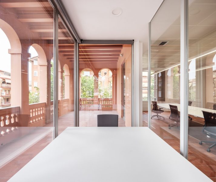
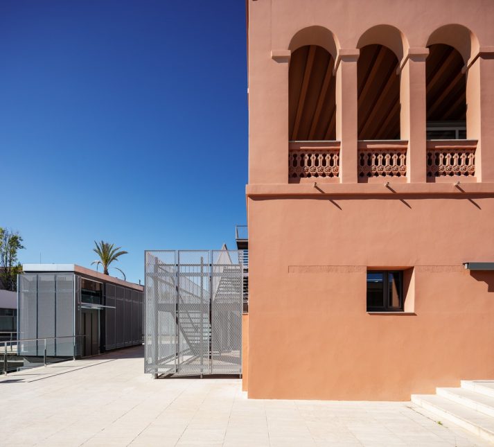
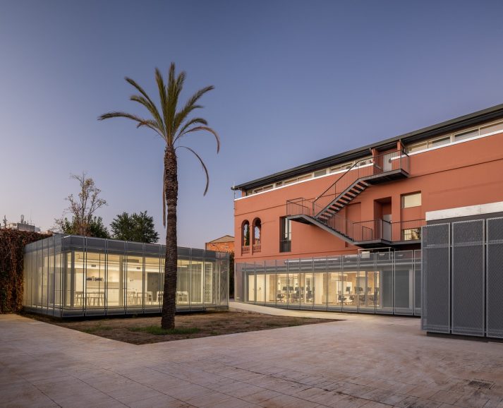
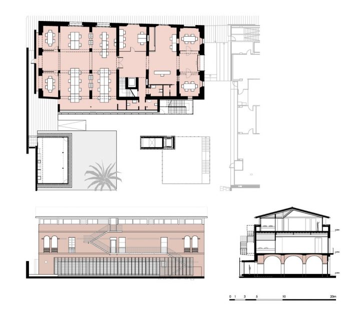
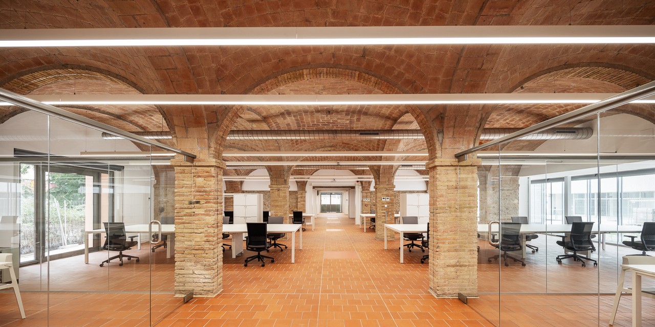
Despite the scope of the intended intervention, our team worked to restore the original farmhouse as much as possible—regardless of previous renovations that had changed its configuration. Our goal was to rediscover its original spaces, the original breadth of the rooms and characteristic structural elements like the pillars and vaulted ceilings on the ground floor, the system of walls and doors on the first, the practically untouched façades, the loggias on either end, the façades that open onto the street, the woodwork, etc. We also took into account elements from the previous intervention, like the interior stairs and elevator, the cement walls, the glass-enclosed gallery that opens onto the patio and the ample open space located directly below the roof.
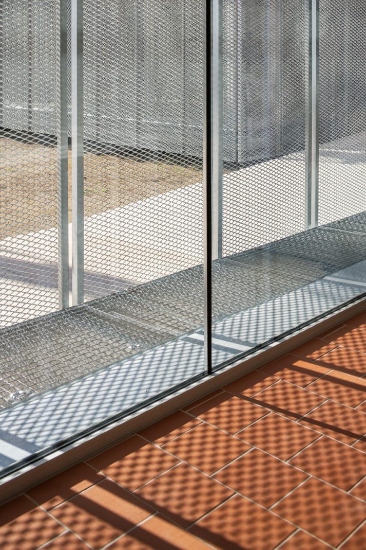
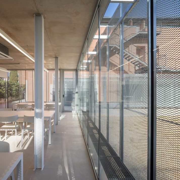
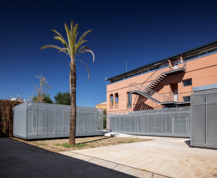
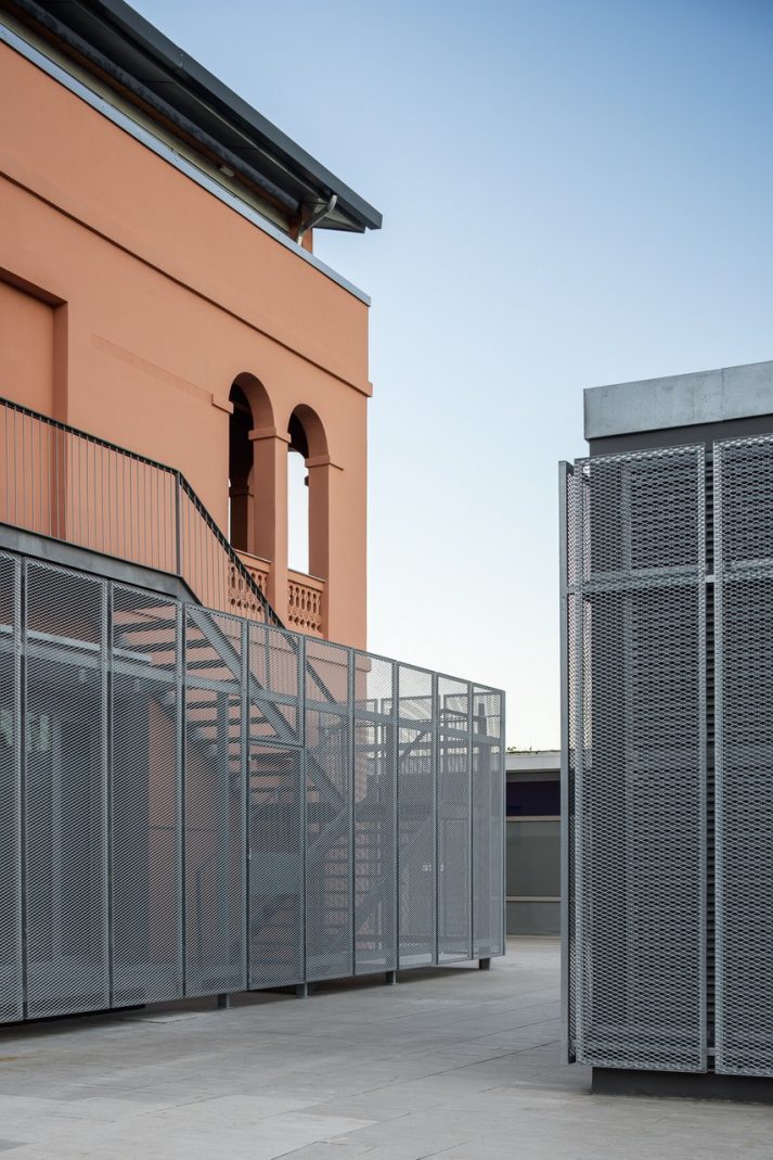
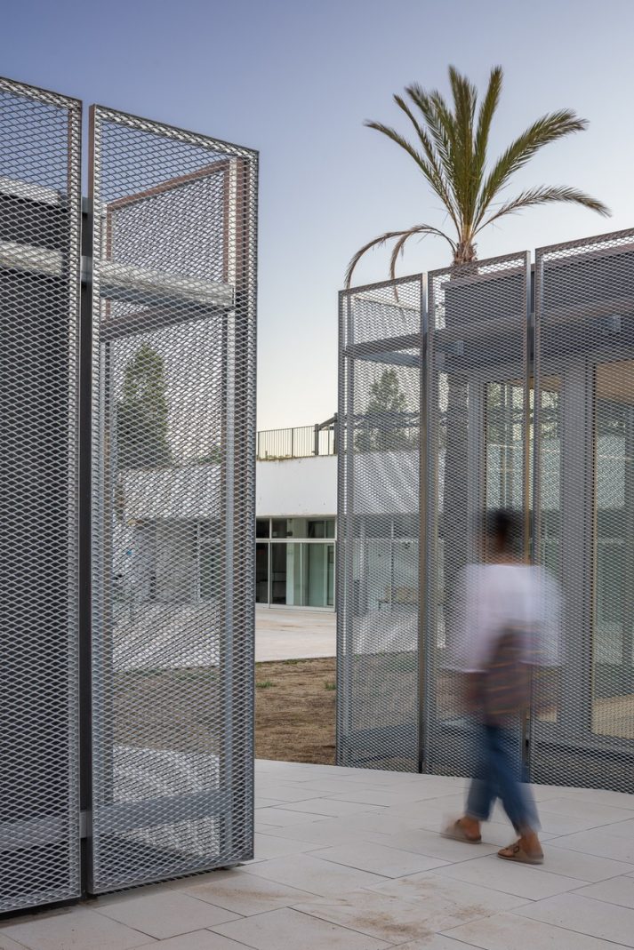
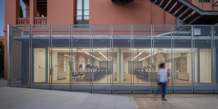
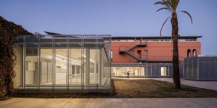
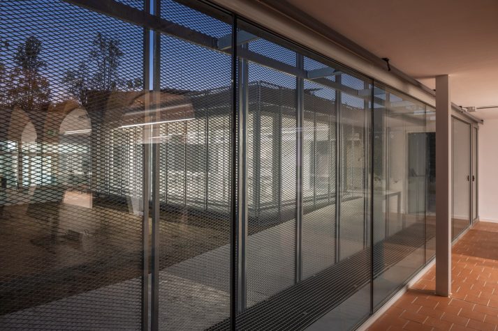
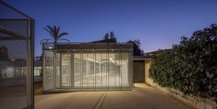
Some of the most recent interventions were visible and drastic, even invasive. The metal emergency stairs on the western façade, the new pavilion/dining room on one end of the lot, the elevator and ventilation system in the middle of the patio… These were piled on top of previous interventions that hadn’t respected the original dimensions of the building. As a result, we imagined enveloping them in a new skin of expanded metal, creating a rhythmic geometry to unify them and making them both visually interesting and climactically sensible. This gesture tenses the contrast between the ethereal lightness of the new metal latticework and the earthy colour of the farmhouse’s old walls.
We opted for the colour of terracotta, both in the form of rough ceramics and smooth linoleum. That way, the floors speak the same language as the vaulted ceilings and the building’s outer skin, and provide an austerity that enriches this type of architecture. In the end, the use of the space by humans, their objects and clothing will provide additional colours and make it more personable.
In summary, we did our best to leave no author’s mark. Instead, we let the old farmhouse tell its own story.
In collaboration with Ponsfort and Anna Ortega.
Pictures by Judith Casas.
Category
New construction


